Linear and Logistic Regression
Overview
Teaching: 30 min
Exercises: 30 minQuestions
How to do regression from real data using Pandas and Scikit-learn
Objectives
Learn how to use Pandas and Scikit-Learn to predict values
For this exercise, we will use a series of statistics about countries to try to predict values for countries with lacking data.
The United Nations Development Programme have been collecting a variety of indicators including life expectancy, health conditions, education, and per capita income in order to produce a statistic composite intex called the Human Development Index (HDI)
We will use this real data as an example of the kind of things that we can do in Regression analysis.
Regression analysis is a set of statistical processes for estimating the relationships among variables.
We will work on an isolated python environment for this exercise, it is very possible that a HPC cluster offers all or most of the packages that we will need for this exercise, but lets assume that we do not have them and install all the needed packages.
We start creating a python virtual environment, all that you need is a Python 3 deployment on your machine. After that we will create a virtual environment with:
virtualenv reg_hdi
The name of the virtual environment is reg_hdi. This name is arbitrary.
Now we activate the environmet with:
cd reg_hdi
source bin/activate
Notice that your prompt shell have changed adding (reg_hdi) at the very beginning. This is an indication that we are inside a python virtual and all python external modules must reside inside the environment.
For this exercise we will need a few packages. Lets try first installing these well know packages.
pip install numpy pandas sklearn matplotlib ipython
Numpy is essential for intensive numerical operations in Python. Pandas is a package for data analysis and will help us reading the data and extracting the values of interest for us. Skit-learn is a library of Machine Learning algorithms ready to use from Python. Matplotlib is the standard plotting package and IPython will provide us with a full-featured Python shell for us, very useful for conducting numerical explorations are we will do now.
Now is time of gathering the data, in real life this is painstaking procedure, collecting data from several sources, normalizing its values and ensuring a consistent measuring stick for values coming from different sources. We will skip this step and take all the data from a source that we consider reliable. Go to http://hdr.undp.org/en/data
On the left hand side click on the box “Download 2018 Human Development Data Bank”. You can prefer to download directly from the command line if you are working on the cluster:
wget http://hdr.undp.org/sites/default/files/2018_all_indicators.xlsx
Now we will enter into the IPython shell.
ipython3
One of the advantages of using IPython over the standard python shell is the ability to execute commands like ls. Check that the Excel file 2018_all_indicators.xlsx is present.
In [1]: ls
2018_all_indicators.xlsx  bin/  include/  lib/  lib64@  share/
Now we import pandas and lets try to read the excel file
In [2]: import pandas

In [3]: df=pandas.read_excel("2018_all_indicators.xlsx")
You should get an error indicating that the version of excel is too new and we need an extra python package to deal with it. Exit from the IPython session and use pip to install the missing package.
...
...
ImportError: Install xlrd >= 1.0.0 for Excel support

In [4]: exit()
pip install xlrd
Collecting xlrd
  Downloading https://files.pythonhosted.org/packages/b0/16/63576a1a001752e34bf8ea62e367997530dc553b689356b9879339cf45a4/xlrd-1.2.0-py2.py3-none-any.whl (103kB)
     |████████████████████████████████| 112kB 2.9MB/s
Installing collected packages: xlrd
Successfully installed xlrd-1.2.0
Lets return to IPython, reload pandas again and now we can create the Pandas DataFrame from the excel file. The first magic commands are for IPython to generate plots in case that you are exporting X11 to your own desktop computer.
In [1]: %gui

In [2]: %matplotlib

In [3]: import pandas

In [4]: df=pandas.read_excel("2018_all_indicators.xlsx")
After a few seconds you should have a DataFrame called df with all the countries indicators updated up to 2018. Actually the last data available was collected in 2017 and that is what we will use for this exercise.
Lets have a look at the dataframe:
In [5]: df
Out[5]:

...
...
...

[25636 rows x 34 columns]
As you can see there is a large amount of data, not much for a modern computer but still too large for a human to see and make sense out of it just by looking the numbers.
It is important to familiarize yourself with the data a hands. Lets check the labels for the 34 columns there:
In [6]: df.columns

Out[6]:
Index([     'dimension',   'indicator_id', 'indicator_name',           'iso3',
         'country_name',             1990,             1991,             1992,
                   1993,             1994,             1995,             1996,
                   1997,             1998,             1999,             2000,
                   2001,             2002,             2003,             2004,
                   2005,             2006,             2007,             2008,
                   2009,             2010,             2011,             2012,
                   2013,             2014,             2015,             2016,
                   2017,             9999],
      dtype='object')

In [7]:
You can see that there are two columns to tell the kind of indicator on that row indicator_id and indicator_name and two columns to know the tell the country iso3 and country_name. You can thing about this data as a number Ni of indicators for a number Nc of countries and a number Ny of years. We have data in a 3D cube and every single value is represented in one 3D location of the cube. As Excel files are just tables,
the data is organized to fit in a 2D table. It will be our task to extract the data that we need from it.
Lets see how the data looks like for just one country. Lets take Afghanistan (ISO code AFG)
In [8]: df.loc[df['iso3']=='AFG']

Out[8]:
                                dimension  indicator_id                                     indicator_name iso3 country_name    1990    1991    1992    1993    1994  ...    2009     2010    2011     2012     2013     2014     2015       2016     2017       9999
0                       Composite indices        146206                                           HDI rank  AFG  Afghanistan     NaN     NaN     NaN     NaN     NaN  ...     NaN      NaN     NaN      NaN      NaN      NaN      NaN    168.000  168.000        NaN
189                     Composite indices        137506                      Human Development Index (HDI)  AFG  Afghanistan     NaN     NaN     NaN     NaN     NaN  ...   0.453    0.463   0.471    0.482    0.487    0.491    0.493      0.494    0.498      0.498
378                            Demography         47906                                 Median age (years)  AFG  Afghanistan  15.900     NaN     NaN     NaN     NaN  ...     NaN   16.000     NaN      NaN      NaN      NaN   17.300        NaN      NaN     17.300
563                            Demography        122006  Old-age (65 and older) dependency ratio (per 1...  AFG  Afghanistan   4.400   4.500   4.500   4.500   4.600  ...   4.600    4.600   4.600    4.700    4.700    4.700    4.700      4.700    4.800      4.800
748                            Demography         63106                   Population ages 15–64 (millions)  AFG  Afghanistan   6.100   6.500   7.000   7.500   8.100  ...  14.000   14.400  14.900   15.600   16.400   17.100   17.900     18.600   19.200     19.200
933                            Demography        132706            Population ages 65 and older (millions)  AFG  Afghanistan   0.300   0.300   0.300   0.300   0.400  ...   0.600    0.700   0.700    0.700    0.800    0.800    0.800      0.900    0.900      0.900
1118                           Demography        132806
...                                   ...           ...                                                ...  ...          ...     ...     ...     ...     ...     ...  ...     ...      ...     ...      ...      ...      ...      ...        ...      ...        ...

24789  Work, employment and vulnerability        123806  Old-age pension recipients (% of statutory pen...  AFG  Afghanistan     NaN     NaN     NaN     NaN     NaN  ...     NaN      NaN     NaN      NaN      NaN      NaN      NaN        NaN      NaN     10.700
24964  Work, employment and vulnerability        140606            Unemployment, total (% of labour force)  AFG  Afghanistan     NaN  12.000     NaN     NaN     NaN  ...   6.700    7.800   8.200    7.900    8.500    8.700    8.900      8.800    8.800      8.800
25144  Work, employment and vulnerability        110906                 Unemployment, youth (% ages 15–24)  AFG  Afghanistan     NaN  25.600     NaN     NaN     NaN  ...  13.900   16.500  17.300   16.600   17.500   17.900   18.100     17.900   17.700     17.700
25324  Work, employment and vulnerability         43006      Vulnerable employment (% of total employment)  AFG  Afghanistan     NaN  62.000     NaN     NaN     NaN  ...  69.000   67.200  66.600   65.400   65.100   65.300   65.800     66.000   66.100     66.100

[136 rows x 34 columns]

In [7]:
There are 136 rows of data for each country. Above you see just the first and last rows. If you want to see all of them you can adjust pandas print options to give you more rows each time.
In [9]: pandas.set_option('display.max_rows', 200)
Now is time for our first exploration on the data. We can think as reasonable that the richer the country, measured by Gross Domestic Product (GDP) should yield a higher life expectancy. This is good point to make a pause and think about the limitations of any model. In thermodynamics there are two kinds of variables. Intensive and Extensive properties. Intensive properties are those that do not depend on the amount of matter, and extensive properties depend on the amount of matter. The same idea can be translated into economical properties like GDP. It is clear that GDP alone is not a good property to use as it could increases with the size of population. So it is better to use the GDP per capita, the GDP divided by the population of the country. This measure again is not without issues. Inequality in countries results in concentration of wealth in the hands of very few. You should always being aware of this limitations when later we try to come out with conclusions.
Right now we will see if GDP per Capita and Life Expectancy correlates to each other in a positive way. ie the the larger is the value of first the highest the value of the second. If you see from the data for Afghanistan, those two indicators are tagged with values 136706 for “GDP per capita (2011 PPP $)” The (2011 PPP $) meaning the Purchasing Power Parity (PPP) a way of avoid distortions due to exchange rates and prices of products between different countries. The other indicator is 69206 for Life expectancy at birth (years). With these two numbers we can extract the information that we need for all the countries.
In [10]: gdpcap=df.loc[df['indicator_id']==136706][['indicator_name','iso3',2017]]
In [11]: lifeexp=df.loc[df['indicator_id']==69206][['indicator_name','iso3',2017]]
See both dataframes and check the number of rows for each. Notice that the number is not the same, meaning that there are some countries with rows missing for the GDP per capita. In real life that is often what happens, you have mising rows, and also you can see that there are countries with NaN for life expectancy. This is still a very curated table, so bad data is not something to be expected, but in real life you will see unreasonable values. Be prepared to clean those out if needed.
Oue next step is to collect both dataframes in a single one. What we are doing is converting a 3D collection of data and gathering an slice, one single year (2017) for a couple of indicators and for all countries. Pandas offers a very efficient tool for this with the merging method.
In [12]: c_stats=pandas.merge(gdpcap,lifeexp, on='iso3')
There are values there that are NaN, the good news is there are not too many and we can remove all of them an still get a good distribution of data points. Pandas offers a way to remove all the rows with NaN values
In [24]: c_stats_good=c_stats.dropna()
Now, lets have a look to what we have right now:
In [25]: c_stats_good

Out[25]:
                indicator_name_x iso3    2017_x                  indicator_name_y  2017_y
0    GDP per capita (2011 PPP $)  AFG    1804.0  Life expectancy at birth (years)    64.0
1    GDP per capita (2011 PPP $)  ALB   11803.0  Life expectancy at birth (years)    78.5
2    GDP per capita (2011 PPP $)  DZA   13914.0  Life expectancy at birth (years)    76.3
3    GDP per capita (2011 PPP $)  AGO    5819.0  Life expectancy at birth (years)    61.8

..                           ...  ...       ...                               ...     ...

182  GDP per capita (2011 PPP $)  VNM    6172.0  Life expectancy at birth (years)    76.5
183  GDP per capita (2011 PPP $)  YEM    1479.0  Life expectancy at birth (years)    65.2
184  GDP per capita (2011 PPP $)  ZMB    3689.0  Life expectancy at birth (years)    62.3
185  GDP per capita (2011 PPP $)  ZWE    1900.0  Life expectancy at birth (years)    61.7

[183 rows x 5 columns]

In [26]:
We have 183 countries with good data for our experiments.
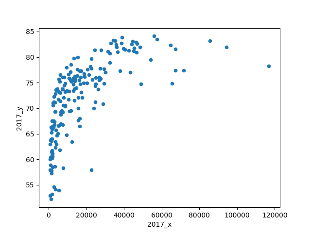
Let see how they look in a plot:
In [11]: c_stats_good.plot(kind='scatter', x="2017_x", y='2017_y')

Out[11]: <matplotlib.axes._subplots.AxesSubplot at 0x7fb805b1e7b8>
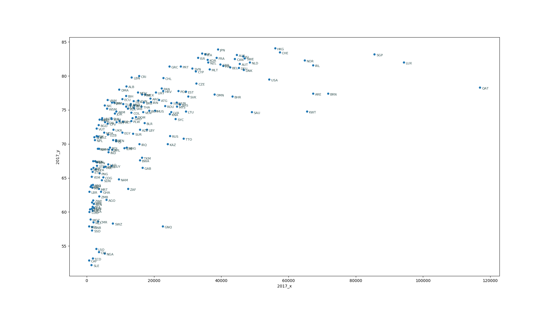
This is working figure so we will not focus too much on labels right now, but having the codes for the countries is a nice addition and help us understand the data.
In [15]: for ind,vals in c_stats_good[['iso3', '2017_x', '2017_y']].iterrows():
    ...:     plt.annotate(vals['iso3'],(vals['2017_x'], vals['2017_y']),xytext=(5,-5), textcoords='offset points',family='sans-serif', fontsize=8, color='darkslategrey')
    ...:
Up to now, all that we have done is to gather the data, selecting a couple of features and visualize how they are related. Now is time for doing regression analysis. Regressing analysis is a set of techniques that allow us to get prediction on new data based on a collection of known values. This is part of the supervised learning that we discuss in the first episode.
The simplest methods or regression assume that there is a linear relation between the features. It is clear from the figure that the GDP per Capita and the life expectancy are positively related, ie when a country increases its GDP per Capita people have the tendency to live longer. However, at some point a wealth country reaches a biological limit for aging, a limit that is either intrinsic to human biology or to our current level of technology. Either way it is clear that a simple linear model is not good enough in this case, at least not for a single variable.
Lets continue with the Linear Regression and see what we get. Scikit-Learn offers Linear Regression with a very simple interface.
In [7]: from sklearn.linear_model import LinearRegression
   ...: lin_reg_model = LinearRegression()
All that we have to do is offering to the model a set of (n_cases, m_features) and n_results. In our case we are just working with a single feature (gdpcap) and we have 183 cases. We order those as a pandas or numpy array with 2 dimensions for X and a single dimension for y:
In [10]: import numpy as np

In [11]: X=np.c_[c_stats_good['2017_x'].tolist()]
    ...: y=np.c_[c_stats_good['2017_y'].tolist()]
    ...:
Take the opportunity to have a look at the data, it should have 1 column and 183 rows. The rows represent the known cases and for each we are offering a single feature.
In [13]: X.shape
Out[13]: (183, 1)

In [14]: y.shape
Out[14]: (183, 1)
The next step is to fit, in a ordinary linear regression also called Ordinary Least Squares (OLS) the algorithm is trying to get the parameters of a line (slope and intercept) that minimizes the sum of the vertical distances between the known values and the predicted value from the line.
In [16]: lin_reg_model.fit(X,y)
Out[16]: LinearRegression(copy_X=True, fit_intercept=True, n_jobs=None, normalize=False)

In [17]: lin_reg_model.coef_
Out[17]: array([[0.00025899]])

In [18]: lin_reg_model.intercept_
Out[18]: array([67.38380155])
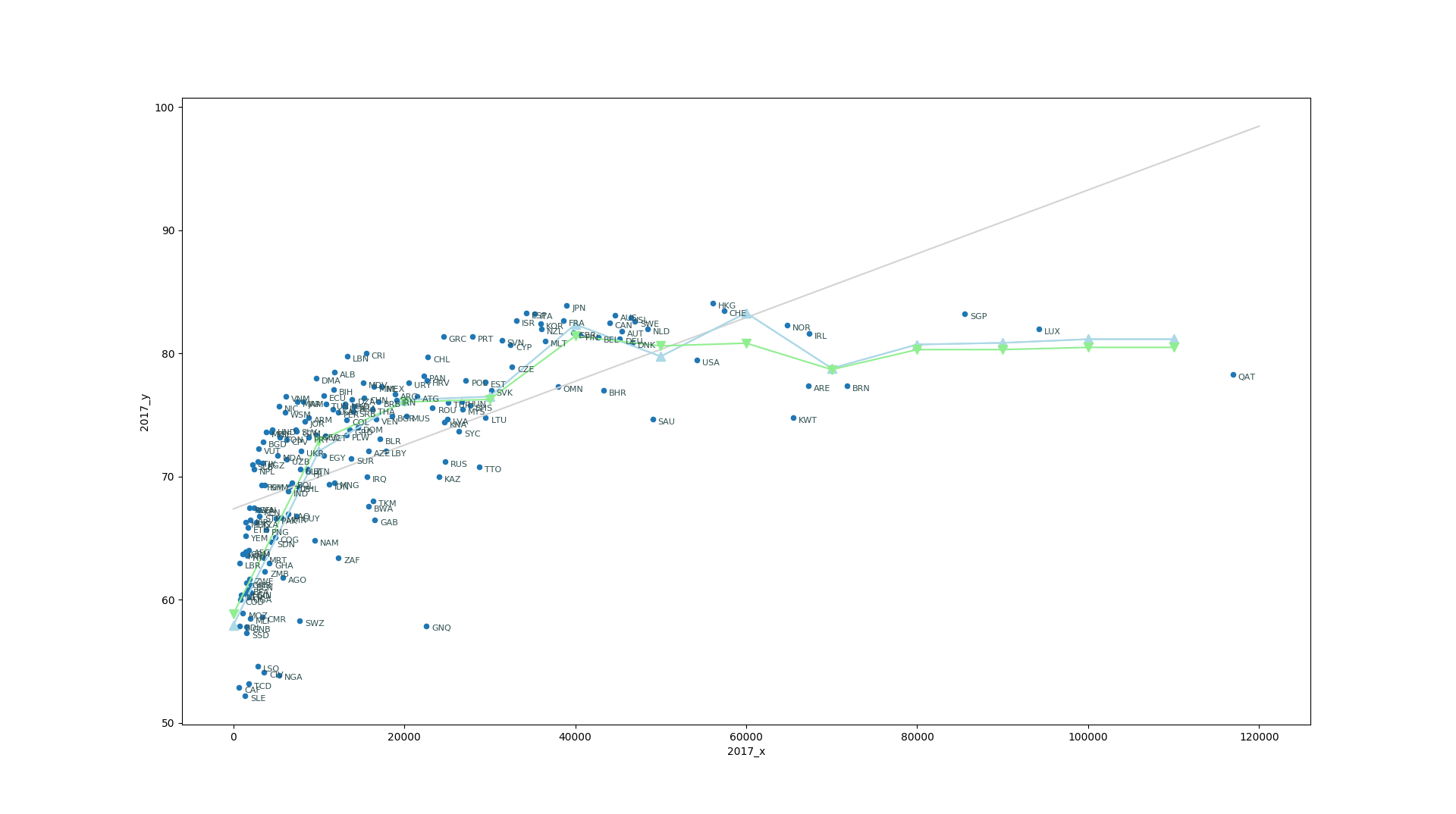
For a single feature we have just two parameters to fit, the slope and the intercept, in our case, the intercept should be the life expectancy for a country that has Zero GDP resulting in an age of 67.3 years. Lets see how that looks in our plot.
In [24]: import numpy as np

In [25]: xx=np.array([0,120000])

In [26]: yy=xx*lin_reg_model.coef_[0]+lin_reg_model.intercept_[0]

In [27]: plt.plot(xx,yy, color='lightgray')

Out[27]: [<matplotlib.lines.Line2D at 0x7fa048ddb908>]
It should be clear what a Linear regression is trying to do. Despite of countries with large gdpcap and the poor countries with very low life expectancy the model search for a line that better adjust the values. We will review this later on, but this is a good opportunity to show another regression model.
You can assume that in order to get an estimate of the life expectancy for a country what you can do is searching for a country or set of countries that is close it in the features space, as we have just a single feature you can thing that by appropriated weighting on near neighbors you can devise an approximate lifeexp.
Scikit Learn offers the class KNeighborsRegressor that is able to predict values using a given number of neighbors. In order to see how that works we can use a range of values for gdpcap and see the resulting prediction with 3 and 5 neighbors.
In [34]: from sklearn.neighbors import KNeighborsRegressor
    ...: nreg3=KNeighborsRegressor(n_neighbors=3)
    ...: nreg3.fit(X,y)

Out[34]:
KNeighborsRegressor(algorithm='auto', leaf_size=30, metric='minkowski',
                    metric_params=None, n_jobs=None, n_neighbors=3, p=2,
                    weights='uniform')

In [35]: nreg5=KNeighborsRegressor(n_neighbors=5)
    ...: nreg5.fit(X,y)

Out[35]:
KNeighborsRegressor(algorithm='auto', leaf_size=30, metric='minkowski',
                    metric_params=None, n_jobs=None, n_neighbors=5, p=2,
                    weights='uniform')
Now we can plot the predicted values using 3 and 5 neighbors
In [41]: plt.plot(xx,y3, label='3 Neighbors', color='lightblue', marker='^', markersize=8)

Out[41]: [<matplotlib.lines.Line2D at 0x7fa048919668>]

In [42]: plt.plot(xx,y5, label='5 Neighbors', color='lightgreen', marker='v', markersize=8)

Out[42]: [<matplotlib.lines.Line2D at 0x7fa048919160>]
The KNeighborsRegressor is simple and for this case it offers better predictions but it is not parametric, ie you need the whole set of points to produce any prediction. On the contrary a parametric model like LinearRegression once you have determined the coefficients, the data itself is not longer used, an equation, in this case a line can predict new values alone.
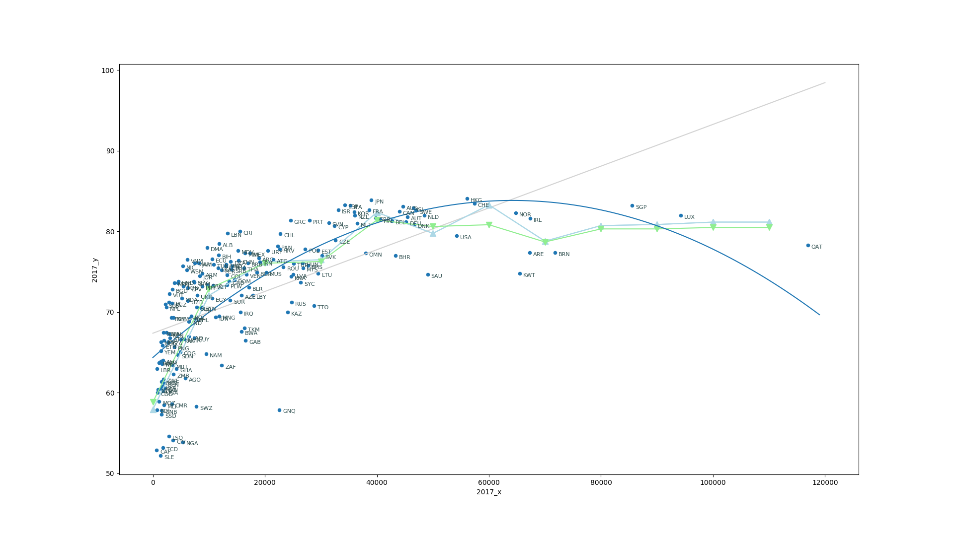
Up to now we have assume a linear relation between gdpcap and lifeexp something that clearly is not a valid assumption for this pair of features. We can keep the machinery of LinearRegression and use a trick to model the problem with a curve. The trick consists in creating new variables
With a simple transformation where:
With this transformation of variables, we can use the same machinery of LinearRegression to try to account for the non-linearity of the relation between gdpcap and lifeexp
In [58]: from sklearn.preprocessing import PolynomialFeatures

In [59]: pr= LinearRegression()

In [60]: quadratic = PolynomialFeatures(degree=2)

In [61]: X_quad = quadratic.fit_transform(X)

In [62]: xx=np.arange(0,120000,10000)[:,np.newaxis]

In [64]: xx=np.arange(0,120000,1000)[:,np.newaxis]

In [65]: pr.fit(X_quad,y)
Out[65]: LinearRegression(copy_X=True, fit_intercept=True, n_jobs=None, normalize=False)

In [66]: y_quad_fit=pr.predict(quadratic.fit_transform(xx))

In [67]: plt.plot(xx,y_quad_fit)
Out[67]: [<matplotlib.lines.Line2D at 0x7fa0816a0080>]
But we have now another problem, for very rich countries we are not predicting high life expectancy but the polinomial model is actually showing a decrease in the value. The fundamental problem is that GPD alone is not sufficient to predict life expectancy. The distribution of the wealth is also important. If money is very few hands, those hands will have longer life expectancy at expenses of many with short lifes. We need to include inequality and maybe some other features to actually account for the complexity of the data.
At this point what we can do is to go back gather more features and study in more detail the relationships between them.
Visualizing relations between features
Lets start from scratch and gather the data again, this time we will not focus on the GDP alone but include a few more economical features and the relations between them. For that we will use a package called seaborn that uses matplotlib to produce plots comparing several features in a single plot.
pip install seaborn
And lets recover the DataFrame with all the values again
In [1]: %matplotlib
Using matplotlib backend: TkAgg

In [2]: import numpy as np

In [3]: import pandas
   ...: df=pandas.read_excel("2018_all_indicators.xlsx")

In [4]: import matplotlib.pyplot as plt

In [5]: import seaborn as sns
Key Points
First key point. Brief Answer to questions. (FIXME)


